FII, DII, Client and Pro: Reading the COT Index
A first look at all four participant readings—and why COT values are different from long-position percentages.
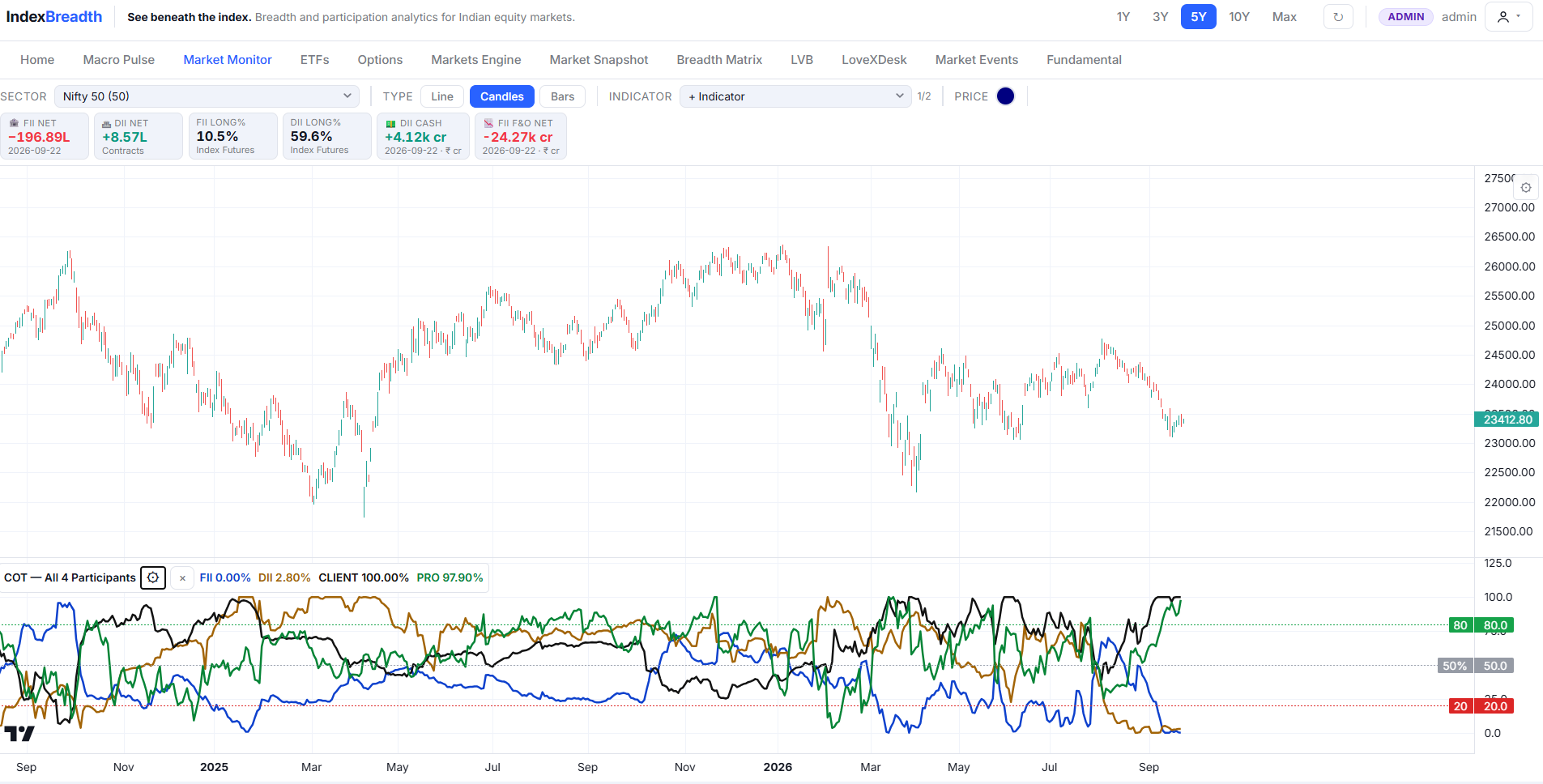
Who is moving together, and who is standing apart? That is the first question I ask when looking at the four-participant COT panel in IndexBreadth.
FII and DII headlines attract plenty of attention. But the participant picture also includes Client and Pro. Putting all four series beside the Nifty helps us see differences that disappear when we focus on just one group.
This is the first article in our FII, DII, Pro & Client series. We are looking at the supplied IndexBreadth snapshot, whose dashboard data cards are dated 22 September 2026. The observations below refer to the displayed chart, not a live feed.
What the four-participant chart shows
Open the chart to view it at full size. Read the COT panel below price separately from the dashboard cards above it.
The panel is labelled COT — All 4 Participants. Its displayed readings are:
| Participant | Line colour | Displayed COT reading |
|---|---|---|
| FII | Blue | 0.00% |
| DII | Brown/orange | 2.80% |
| Client | Black | 100.00% |
| Pro | Green | 97.90% |
The immediate observation is the separation: FII and DII are near the bottom of the displayed scale, while Client and Pro are near its top. The panel also shows reference lines at 20, 50 and 80. Those lines help orient the eye; this snapshot alone does not establish them as tested entry or exit rules.
I think the useful starting point is to notice that the four groups are not showing the same reading. The next step is to follow how that separation changes alongside price, rather than treating an endpoint as a complete market forecast.
Who are FII, DII, Client and Pro?
FII refers to foreign institutional investors; DII refers to domestic institutional investors. Pro refers to proprietary positions, while Client refers to client-account positions. Client should not automatically be read as a single, uniform group of small retail traders.
For public background, NSE publishes participant-wise open-interest and trading-volume reports on its derivatives reports page. These report types describe different things: outstanding positions and trading activity are not interchangeable.
The COT panel discussed here is an IndexBreadth indicator display. Its readings should not be presented as raw NSE contract counts or as the US CFTC’s Commitments of Traders report. This article discusses what is visible without disclosing internal calculations.
What 0% and 100% do not tell us
A displayed FII COT reading of 0.00% does not, by itself, mean FIIs have no positions. A Client reading of 100.00% does not mean every client is long or that clients own the entire market.
These are four indicator readings, not slices of one pie. Adding them together to calculate participant market share would give the numbers a meaning the chart does not establish.
There is a useful reminder in the screenshot itself: the separate FII LONG% card reads 10.5%, while the FII COT line reads 0.00%. The separate DII LONG% card reads 59.6%, while the DII COT line reads 2.80%. Those displays should not be substituted for one another.
Before interpreting a COT reading as a historical positioning extreme, the selected instrument coverage, lookback and indicator definition must be known. They are not specified in this screenshot, so I am keeping this first reading to the visible separation between the groups.
My reading of the Nifty picture
At the right edge of the supplied chart, the Nifty price label is 23,412.80, following a decline from the preceding local highs. Underneath it, the four COT lines are widely separated.
That combination gives us a focused monitoring question: does the participant separation persist as price develops, or do the lines begin to converge?
I would track three developments in subsequent observations:
- Whether the FII and DII readings remain near the lower end or begin moving away from it.
- Whether Client and Pro remain near the upper end or turn lower.
- Whether those changes accompany a sustained improvement in price, another decline, or sideways trading.
The direction of change matters as much as the latest number. A reading that has just reached an extreme can tell a different story from one that has remained there for several sessions. This image does not give us a tested rule for how long either condition can persist.
I would also avoid declaring one participant category permanently right and another permanently wrong. Aggregate positions can reflect hedging and different trading objectives, not just a shared directional opinion.
Where market breadth adds another question
Participant analysis asks about the behaviour of groups of market participants. Stock breadth asks how widely a move is shared across securities.
If the Nifty starts recovering, I would also examine whether more stocks are participating—for example, through advances and declines or the percentage above a moving average. That lets us compare the participant picture with the condition of the underlying market.
Our Breadth Analysis 101 guide introduces those participation questions. The guide to stocks above the 50 DMA explains one way to examine how broadly a trend is shared.
Where to see this on IndexBreadth
The supplied chart comes from Market Monitor, with Nifty 50 selected and COT — All 4 Participants displayed beneath price. Use the combined view to follow FII, DII, Client and Pro together, then compare subsequent observations using consistent settings.
For this snapshot, the clear takeaway is the pronounced split between the four displayed readings. Watching how that split evolves is more informative than turning a single 0% or 100% label into an automatic market call.
Explore the participant picture for yourself: Sign up for IndexBreadth.
Lovelesh Sharma
SEBI Registered RA
INH000027937
CMT, CFTe
The views expressed are for educational purposes only and do not constitute investment advice.
Tags: #MarketBreadth #StocksAboveMovingAverages #IndexBreadth #COTIndex #FIIDII #ParticipantPositioning